Fundamental Problem of Causal Inference#
We’re interested in estimating the effect of a treatment on some outcome. Let \(T\) = treatment and \(Y\) = outcome.
To set up the fundamental problem of causal inference, we need to first introduce the “potential outcomes framework”. A potential outcome is simply the outcome, \(Y\), conditional on a specific event, \(T=1\) or \(T=0\). We’ll use the notation \(Y^1\) to indicate the outcome \(Y\) given that \(T=1\). And \(Y^0\) to indicate the outcome \(Y\) given that \(T=0\).
Then, the treatment effect is \(Y^1 - Y^0\): the difference in the potential outcome where treatment was received and potential outcome where treatment was not received.
The fundamental problem is that only \(Y^1\) or \(Y^0\) is observed since an individual either received treatment or did not. This is also why we call them “potential” outcomes. IF an individual, \(i\), received treatment, then we know \(Y_i^1\). But we do not know \(Y_i^0\) – but can we estimate what the outcome would have been had the individual NOT received treatment?
We call this unobserved outcome the counterfactual. If an individual RECEIVED treatment, the counterfactual is the potential outcome had the individual NOT RECEIVED treatment. If an individual did NOT RECEIVE treatment, the counter factual is the potential outcome had the individual RECEIVED treatment.
Given a dataset, if we knew the counterfactual potential outcomes for all individuals who received and did not receive treatment, we’d be able to estimate the true treatment effect. In this way, causal inference is a sort of missing data problem!
Data Demonstration#
Imagine that you can access alternate universes and you can measure both \(Y^1\) and \(Y^0\) for each individual. Then we wouldn’t have the fundamental problem of causal inference. We call this “God Mode” and your data would look like this:
import pandas as pd
import numpy as np
import seaborn as sns
sns.set(rc={'figure.figsize':(11.7,8.27)})
import matplotlib.pyplot as plt
np.random.seed(0)

df = pd.DataFrame({
    "x1": np.random.normal(0,1,14),
    "x2": np.random.normal(0,1,14),
    "T": np.random.choice([0,1],14),
})

df["y1"] = np.array(df[["x1","x2"]]) @ [2,2] + 3
df["y0"] = np.array(df[["x1","x2"]]) @ [2,2]

print(df.to_markdown())
|    |        x1 |         x2 |   T |        y1 |           y0 |
|---:|----------:|-----------:|----:|----------:|-------------:|
|  0 |  1.76405  |  0.443863  |   0 |  7.41583  |  4.41583     |
|  1 |  0.400157 |  0.333674  |   0 |  4.46766  |  1.46766     |
|  2 |  0.978738 |  1.49408   |   0 |  7.94563  |  4.94563     |
|  3 |  2.24089  | -0.205158  |   1 |  7.07147  |  4.07147     |
|  4 |  1.86756  |  0.313068  |   1 |  7.36125  |  4.36125     |
|  5 | -0.977278 | -0.854096  |   0 | -0.662747 | -3.66275     |
|  6 |  0.950088 | -2.55299   |   1 | -0.205803 | -3.2058      |
|  7 | -0.151357 |  0.653619  |   0 |  4.00452  |  1.00452     |
|  8 | -0.103219 |  0.864436  |   0 |  4.52243  |  1.52243     |
|  9 |  0.410599 | -0.742165  |   1 |  2.33687  | -0.663133    |
| 10 |  0.144044 |  2.26975   |   0 |  7.8276   |  4.8276      |
| 11 |  1.45427  | -1.45437   |   1 |  2.99982  | -0.000184335 |
| 12 |  0.761038 |  0.0457585 |   1 |  4.61359  |  1.61359     |
| 13 |  0.121675 | -0.187184  |   1 |  2.86898  | -0.131018    |
Then we can simply take the average difference between \(Y^1\) and \(Y^0\).
eff = np.mean(df["y1"] - df["y0"])
print(f"The treatment effect is {eff}")
The treatment effect is 3.0
But we are mere mortals. And in reality, our data looks like this. And we can no longer compute the treatment effect!
df.loc[df["T"]==1,"y0"] = None
df.loc[df["T"]==0,"y1"] = None

print(df.to_markdown())

eff = np.mean(df["y1"] - df["y0"])
print(f"The treatment effect is {eff}")
|    |        x1 |         x2 |   T |         y1 |        y0 |
|---:|----------:|-----------:|----:|-----------:|----------:|
|  0 |  1.76405  |  0.443863  |   0 | nan        |   4.41583 |
|  1 |  0.400157 |  0.333674  |   0 | nan        |   1.46766 |
|  2 |  0.978738 |  1.49408   |   0 | nan        |   4.94563 |
|  3 |  2.24089  | -0.205158  |   1 |   7.07147  | nan       |
|  4 |  1.86756  |  0.313068  |   1 |   7.36125  | nan       |
|  5 | -0.977278 | -0.854096  |   0 | nan        |  -3.66275 |
|  6 |  0.950088 | -2.55299   |   1 |  -0.205803 | nan       |
|  7 | -0.151357 |  0.653619  |   0 | nan        |   1.00452 |
|  8 | -0.103219 |  0.864436  |   0 | nan        |   1.52243 |
|  9 |  0.410599 | -0.742165  |   1 |   2.33687  | nan       |
| 10 |  0.144044 |  2.26975   |   0 | nan        |   4.8276  |
| 11 |  1.45427  | -1.45437   |   1 |   2.99982  | nan       |
| 12 |  0.761038 |  0.0457585 |   1 |   4.61359  | nan       |
| 13 |  0.121675 | -0.187184  |   1 |   2.86898  | nan       |
The treatment effect is nan
Randomized Controlled Trials: RCTs#
RCTs are the gold standard to estimate a treatment effect. How does RCT address the fundamental problem of causal inference?
First let’s simulate:
eff_list = []
for _ in range(500):
    df = pd.DataFrame({
        "x1": np.random.normal(0,1,40),
        "x2": np.random.normal(0,1,40),
        "T": np.random.choice([0,1],40),
    })

    df["y1"] = np.array(df[["x1","x2"]]) @ [2,2] + 3
    df["y0"] = np.array(df[["x1","x2"]]) @ [2,2]

    df.loc[df["T"]==1,"y0"] = None
    df.loc[df["T"]==0,"y1"] = None

    eff = df.loc[df["T"]==1, "y1"].mean() - df.loc[df["T"]==0, "y0"].mean()
    eff_list.append(eff)
sns.kdeplot(eff_list)
plt.axvline(np.mean(eff_list),0,1, color="red")
plt.axvline(np.min(eff_list),0,1, color="green")
plt.axvline(np.max(eff_list),0,1, color="blue")
<matplotlib.lines.Line2D at 0x7fc797b387c0>
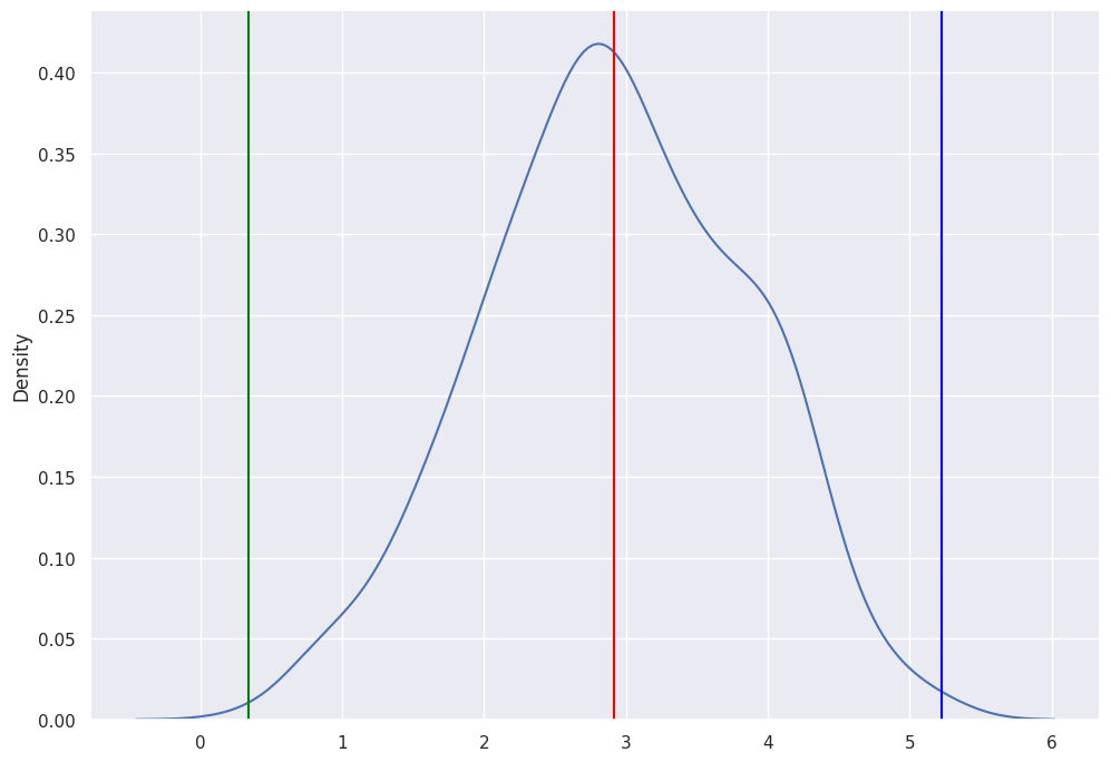
For each treatment, we took the \(Y^1\) for the samples that received treatment and \(Y^0\) for the samples that did not receive treatment. These are both the potential outcomes that are observed. We average each vector then compute the difference to get the Treatment Effect. We store the treatment effect for each of the 500 simulations.
The mean of the simulated effects is 3, which is equal to the true effect. Since treatment assignment is random, we obtain an unbiased estimate of the treatment effect. However, there is still some sampling variability that induces some variability in our estimates. As you can see, for some samples, our estimate may be as high as 5 or as low as 1.
So why does randomization work?#
A short answer is that since we randomly split the group into treatment and control, the groups are exactly alike except that one group received treatment and the other group did not.
But what does “exactly alike” mean?
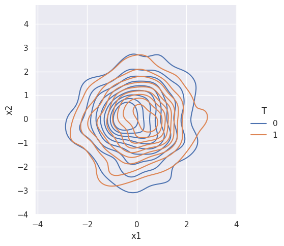
Remember, that the dataframe had 2 variables. And aside from treatment, outcome is a function of only these 2 variables. Let’s look at their density plots.
df = pd.DataFrame({
    "x1": np.random.normal(0,1,500),
    "x2": np.random.normal(0,1,500),
    "T": np.random.choice([0,1],500),
})

df["y1"] = np.array(df[["x1","x2"]]) @ [2,2] + 3
df["y0"] = np.array(df[["x1","x2"]]) @ [2,2]

df.loc[df["T"]==1,"y0"] = None
df.loc[df["T"]==0,"y1"] = None
sns.displot(data=df, x="x1", y="x2", hue="T", kind="kde")
<seaborn.axisgrid.FacetGrid at 0x7fc79bf0ef40>
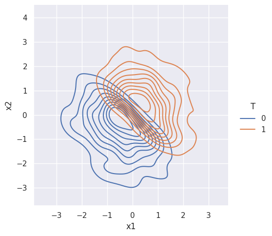
Suppose treatment is NOT random. Then the treatment and control groups are NOT alike:
df["T"] = np.where(df["x1"]+df["x2"]>0,1,0)
sns.displot(data=df, x="x1", y="x2", hue="T", kind="kde")
<seaborn.axisgrid.FacetGrid at 0x7fc79bf0ef70>
Observational Studies#
RCT is often not possible and can even be unethical. As an example, you can’t assign people to smoke cigarettes. Can we use data without random treatment assignment to evaluate a causal impact? (e.g. the example directly above) It depends and most of the study of causal inference concerns this question.