Regression Discontinuity#
When an observational study has a non-random treatment that is applied using a threshold or cutoff, a regression discontinuity design may be useful to estimate the treatment effect.
To illustrate with an example, suppose that students are selected into a specialized high school based ONLY on test scores and further, there is a strict cutoff such that all students who score at least 600 are admitted and all students under 600 are rejected. And suppose that our causal question of interest is to evaluate the effectiveness of this specialized high school on students’ test scores – so the outcome may be SAT scores or any other standardized test… but for simplicity, let’s define a metric that measures students’ standardized test scores after two years of high school.
With the potential outcomes framework in mind, the problems here should be clear. First, the treatment is not random. Students who score high are more likely to receive the treatment. Second, we’d expect the entrance exam to be an important confounder – in fact it is the ONLY confounder – but there’s 0 overlap between the treatment and control students on this covariate.
Regression discontinuity addresses both of these problems by assuming that students with entrance exam scores close to the cutoff have identical potential outcomes. In an extreme example, suppose a very narrow cutoff of just 1 point. It’s easy to see that students who score between 599 and 601 are very similar with respect to their test-taking abilities and there could be all sorts of random reasons that one student scored a little higher than the other. How wide can we make this window while maintaining this assumption?
import numpy as np
np.random.seed(0)
import pandas as pd
import matplotlib.pyplot as plt
import seaborn as sns
sns.set(rc={'figure.figsize':(11.7,8.27)})

df1 = pd.DataFrame({
    "entrance_score":np.random.normal(570,30,200),
    "error":np.random.normal(10,30,200),
    "treat":False
})
df1["yr2_score"] =  1 * df1["entrance_score"] + df1["error"]

df2 = pd.DataFrame({
    "entrance_score":np.random.normal(630,30,200),
    "error":np.random.normal(10,30,200),
    "treat":True
})
df2["yr2_score"] =  50 + 1 * df2["entrance_score"] + df2["error"]

df = pd.concat([
    df1.query("entrance_score<600"),
    df2.query("entrance_score>=600")
])
sns.scatterplot(x="entrance_score", y="yr2_score", hue="treat", data=df)
plt.axvline(600, 0, 1000, color="black")
<matplotlib.lines.Line2D at 0x7f7c18461580>
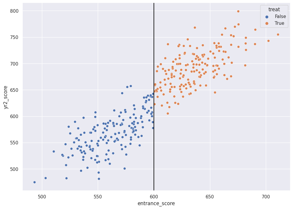
In the fake data example, the color indicates the admitted vs the rejected students. The x-axis is the entrance score and the cutoff is at 600. The y-axis is the test score after two years of high school, “the treatment”. In this fake example, the treatment does appear very effective. For students who scored close to 600, the treatment group has scores that are higher than the control group by ~50 points on average.
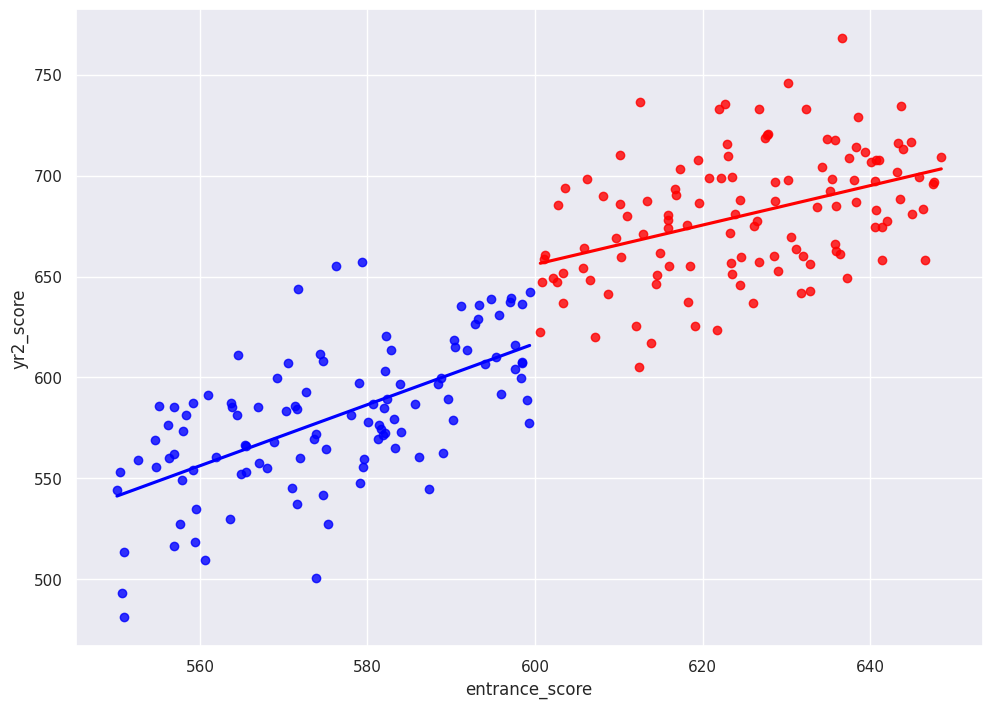
We might select a window of 50 and compare averages between the treated and control groups to estimate a treatment effect:
df_window = df.loc[df["entrance_score"].between(550,650)]
treat_mu = np.mean(df_window.loc[df_window["treat"]==True, "yr2_score"])
control_mu = np.mean(df_window.loc[df_window["treat"]==False, "yr2_score"])

sns.regplot(x="entrance_score", y="yr2_score", data=df_window.query("treat==True"), color="red", ci=False)
sns.regplot(x="entrance_score", y="yr2_score", data=df_window.query("treat==False"), color="blue", ci=False)
<Axes: xlabel='entrance_score', ylabel='yr2_score'>
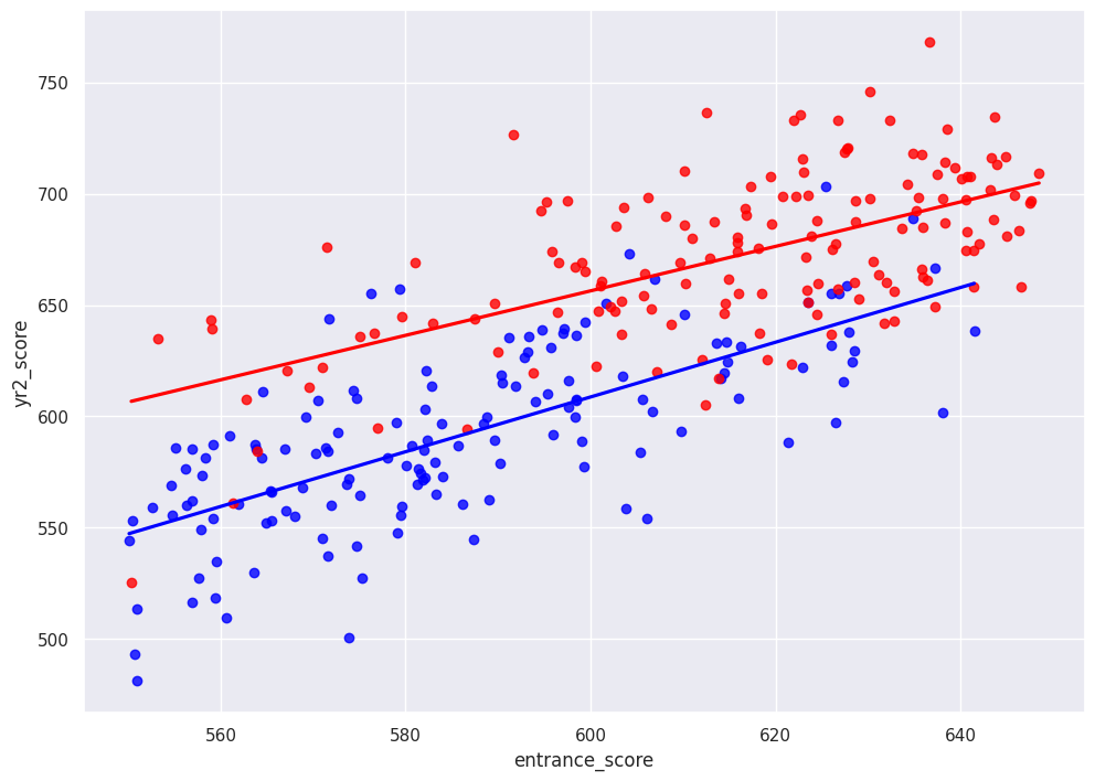
To demonstrate the assumptions, I plot the unobservable and theoretical potential outcomes below. The plot extrapolates the treatment group to scores below the cutoff and control group to the scores abvoe the cutoff. Then, it’s just like any other regression where we’re interested in the coefficient of some binary covariate that compares two groups.
sns.regplot(x="entrance_score", y="yr2_score", data=df1.loc[df1["entrance_score"].between(550,650)], color="blue", ci=False)
sns.regplot(x="entrance_score", y="yr2_score", data=df2.loc[df2["entrance_score"].between(550,650)], color="red", ci=False)
<Axes: xlabel='entrance_score', ylabel='yr2_score'>
"""
To-do:
- What if we don't have linear slopes?
- What if we have a fuzzy cutoff (as opposed to clean cutoffs shown above)?
"""
"\nTo-do: \n- What if we don't have linear slopes? \n- What if we have a fuzzy cutoff (as opposed to clean cutoffs shown above)? \n"